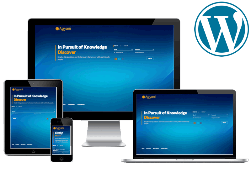
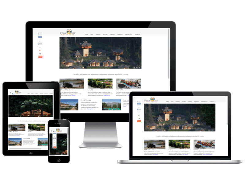
Responsive Website Development & Design

Responsive Website Development & Design

Responsive website development ensures that your website looks beautiful across multiple devices.

  • Exciting user interfaces with responsive layouts are needed for the hour. Responsive design delivers that.
  • Our team is adept at developing a responsive website that fits nicely on all desktop as well as mobile devices.
  • Search engines like Google now give more importance ranking to a responsive website than others.

Request a quote today

Responsive Website Development is a “Need”

Understanding Responsive Website Development (Responsive Web Design)

  • A responsive web design is about creating web pages that look good on all devices. A responsive web design will automatically adjust for different screen sizes and viewports.

  • Responsive web design is the approach that suggests that design and development should respond to the user’s behaviour and environment based on screen size, platform and orientation.

  • Responsive website development goes beyond the desktop. We craft designs that respond to your users’ needs and devices. Mobile & portable devices are propagating at a phenomenal rate.
  • Responsive website development delivers a consistent, professional, and enjoyable user experience across devices with different screen resolutions. This encompasses all devices including desktop computers, tablets and smartphones.
  • Responsive website development ensures that the website responds to the user by changing the layout as per the device being used. The layout changes according to the capabilities and size of the device.
  • For example, a mobile phone will show the content in a single column view, whereas a tablet might show the same content in two columns. This is achieved by responsive web design.
  • Responsive web development changes the appearance of a website dynamically, depending on the screen size of the device being used. The responsive design technology uses breakpoints to determine how the layout of the website will appear: one design is used above and another below that breakpoint. The breakpoints in a responsive design are usually based on the width of the browser.
  • The same HTML is served to all devices in a responsive design. CSS determines and changes the appearance of a page.
  • Rather than creating separate websites and comparable codebase for big-screen monitors, laptops, desktops, phones and tablets, a single file supports users with different screens or viewports.
  • Page elements reshuffle in responsive design, as the screen shrinks or grows. A three-column desktop design may change to a two-column for a tablet and for a smartphone the same may change to a single column.
  • In responsive website development, proportion-based grids are relied upon to rearrange the content and design elements. The practice consists of a mix of flexible grids and layouts, images and intelligent use of CSS media queries.

Clients Speak
  • AquAgriAquAgri
  • The Beer CafeThe Beer Cafe
  • Blue Ocean MediaBlue Ocean Media
  • Brand ParentingBrand Parenting
  • ExpertServExpertServ
  • Canton Spice CompanyCanton Spice Company
  • China DollChina Doll
  • CilantroCilantro
  • Chemi KleenChemi Kleen
  • DealsFlowDealsFlow
  • Drool KitchenDrool Kitchen
  • Frankly SpeakingFrankly Speaking
  • Gingerbay ConsultingGingerbay Consulting
  • Gurgaon StaysGurgaon Stays
  • Gold Star AssociatesGold Star Associates
  • HPG ConsultingHPG Consulting
  • iSquare ConsultingiSquare Consulting
  • ITW FEGITW FEG
  • Koti ResortsKoti Resorts
  • M2i ConsultingM2i Consulting
  • MJ LogisticsMJ Logistics
  • Mini MasonMini Mason
  • ONS BrandsONS Brands
  • RAG ScroresRAG Scrores
  • Sethi GroupSethi Group
  • Snow Leopard AdventuresSnow Leopard Adventures
  • Stay Out AdventuresStay Out Adventures
  • Shambala RealtorsShambala Realtors
  • Service SolutionsService Solutions
  • Synergy LogiservicesSynergy Logiservices
  • The Gateway FoundationThe Gateway Foundation
  • Travel InfiniteTravel Infinite
  • The Great Indian VillageThe Great Indian Village
  • AIDA India Logo
  • AD Merchants London Logo
  • Adelante Inc Logo
  • DivaHub Loga

Call us today on +919810205565 to discuss your Responsive Website Development Project.